WHAT YOUR SHIRT COLOR SAYS ABOUT YOU
Color psychology is backed by research. Your shirt color creates unconscious impressions before you speak. Learn which colors communicate trust, authority, confidence — and which hurt your professional image.
Navy blue is the safest, most universally powerful shirt color for professional settings. It communicates trust, stability, and confidence. Dark grey is the second-best choice. White works for formal situations but can feel impersonal. Black projects authority but can seem aggressive. The color matters less than fit—wear the Shirt Tucker to keep any color looking sharp all day.
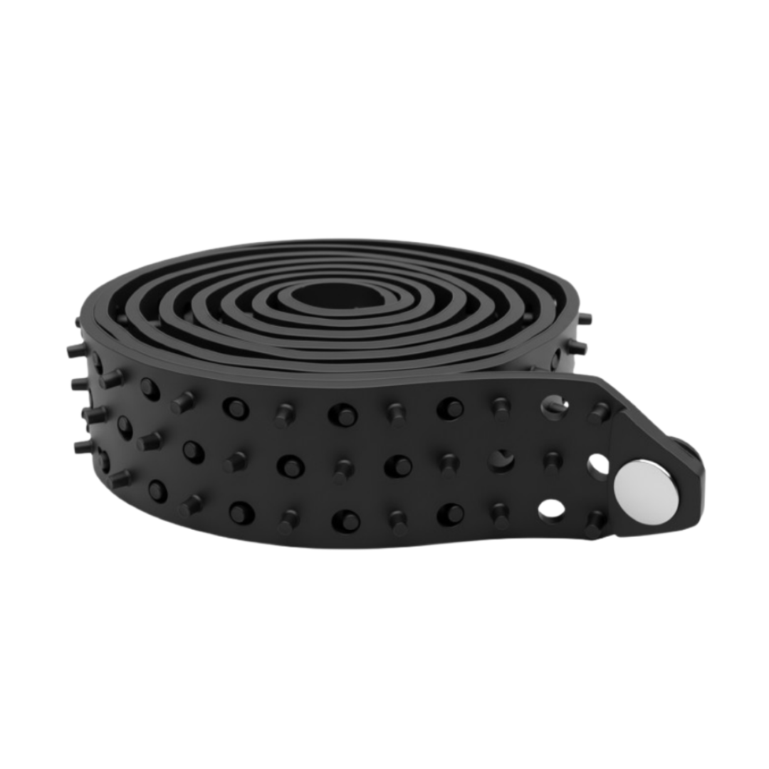
The Shirt Tucker — Complete Your Look with Confidence
The right shirt color sets the tone — but only if it stays tucked and wrinkle-free. The Shirt Tucker rubber belt keeps any color looking crisp and polished all day, so your color strategy actually pays off.
WHY SHIRT COLOR ACTUALLY MATTERS
Most professionals understand that their appearance affects how others perceive them. Grooming matters. Fit matters. But few realize that the exact color of your shirt shapes others' judgments before you open your mouth. This is color psychology, and it's research-backed—not superstition.
When someone sees you for the first time, their brain processes your visual appearance in milliseconds. Before you introduce yourself or shake hands, your shirt color has already triggered emotional responses and unconscious associations. A 2019 study in Color Research & Application found that specific colors reliably influence perception of competence, trustworthiness, and authority. The implications for your career are real.
The challenge: Most professionals wear whatever shirt is in their closet. They don't think strategically about color. This is a competitive advantage you can claim immediately. By understanding what each color communicates—and when to wear it—you'll stand out without changing anything else about your appearance.
Let's break down the psychology of the most important professional shirt colors.
NAVY BLUE — THE UNIVERSAL POWER COLOR
Navy blue is the gold standard for professional dress. It appears in business casual recommendations worldwide because research consistently shows it's the safest, most powerful choice.
What navy communicates: Trust, stability, competence, confidence, intelligence. Navy activates the same positive associations as the ocean or the sky—something vast and dependable. It's formal enough for client meetings but approachable enough for creative environments. Studies on color psychology show blue generates the highest levels of perceived trustworthiness among all colors.
When to wear navy: Client presentations, job interviews, leadership roles, formal events, networking. If you're unsure what color to wear, navy is always correct. It works equally well in conservative industries (finance, law) and creative fields (tech, design). Navy pairs well with every neutral—black shoes, grey trousers, charcoal belts. Your Shirt Tucker in black anchors a navy shirt perfectly, keeping it tucked and intentional all day.
Who it suits: Everyone. Navy is universally flattering across skin tones. Fair skin: navy creates strong contrast. Medium skin: navy is the safe, professional baseline. Dark skin: navy maintains depth without washing you out. This is why it's the default professional color.
The downside: It's so common that it won't make you stand out visually—which is actually an advantage. You want the focus on you, not your shirt color. In competitive environments where everyone is wearing navy, this is your signal to add one quality accessory (a watch, a pin, a belt like the Shirt Tucker) to break the monotony.
WHITE — FORMAL & CRISP, BUT RISKY
White dress shirts are the traditional foundation of professional menswear. They project formality, cleanliness, and precision. But they come with invisible risks.
What white communicates: Cleanliness, formality, purity, precision, simplicity. White is the most formal shirt color—it commands respect in boardrooms and courthouses. Studies show white creates perceptions of order and discipline. The downside: white can feel distant or sterile in casual settings. In pure white, some perceive coldness rather than professionalism.
When to wear white: Job interviews, executive meetings, court appearances, formal events, client calls where first impressions matter most. White is the safer bet than any other color for high-stakes situations. However, avoid pure white in very casual environments—it reads as overdressed and creates distance. Off-white, cream, or ivory soften the impression without losing formality.
The challenge: White is highly visible. Any wrinkles, stains, or untucking shows immediately. This is where the Shirt Tucker becomes essential. A white shirt that comes untucked by 2 PM looks unprofessional. The Shirt Tucker's rubber construction keeps white shirts tucked all day, maintaining that crisp, formal impression through lunch, meetings, and active work.
Skin tone considerations: Fair skin with white shirts can wash you out—pair it with navy trousers or a dark jacket. Olive or tan skin: white is universally flattering. Dark skin: white creates high contrast and stands out. If you have fair or very light skin, warm whites (ivory, cream, off-white) are more forgiving than cool, pure white.
CHARCOAL GREY — SOPHISTICATED & SERIOUS
Dark grey sits between the formality of white and the power of navy. It's the choice of professionals who want to signal sophistication and seriousness without committing to navy.
What charcoal grey communicates: Sophistication, maturity, stability, neutrality, professionalism. Grey is the color of wisdom and experience—it doesn't demand attention the way black or blue does. Studies show grey creates perceptions of maturity and seriousness. In comparison groups, dark grey wearers are perceived as more thoughtful and analytical than their bright-colored counterparts.
When to wear charcoal grey: Strategy meetings, presentations, leadership roles, formal settings where navy might be too common. Dark grey works in nearly every industry. It's especially effective in finance, law, consulting, and healthcare—fields where trustworthiness and analytical thinking are paramount. Grey also pairs beautifully with a charcoal or black Shirt Tucker belt, creating intentional monochrome sophistication.
The advantage: Dark grey is slightly less common than navy, so it stands out without breaking formality. You'll see navy on 80% of the professionals in any room. Dark grey is 15%. This makes it an excellent choice if you want to stay professional while looking slightly more distinctive.
The risk: Too light grey reads as casual or even sloppy. Stick to charcoal or dark grey. Light grey is fine for creative fields or very casual environments, but in conservative industries, it blurs the line between professional and underdressed.
BLACK — MAXIMUM AUTHORITY, MAXIMUM RISK
Black is the most commanding shirt color—but it's also the easiest to misuse. In certain contexts, black conveys power and control. In others, it reads as inappropriate or aggressive.
What black communicates: Authority, power, formality, seriousness, sophistication. Black is the color of leadership. It's worn by judges, CEOs, and high-ranking military officers. Research shows black wearers are perceived as more dominant and confident than their counterparts in lighter colors. But that same dominance can feel intimidating or distant in casual settings.
When to wear black: Leadership roles, high-stakes negotiations, formal evening events, when you need to project maximum authority. Black is less common than navy in business—which makes it stand out more. Use this strategically. In client-facing roles, black signals "I'm in charge." In team environments, it can create distance. A black Shirt Tucker belt completes the effect, creating a unified, powerful silhouette from shoulders to waist.
The risks: Black in business casual looks severe. A black shirt in a creative startup reads as too formal or even funereal. In interviews, black can feel like you're trying too hard. Black also demands perfect fit—wrinkles and untucking look terrible. This is critical: if you wear black to an important meeting and it comes untucked, the impact is devastating. The Shirt Tucker becomes non-negotiable with black shirts.
Skin tone and black: Fair or very pale skin: black creates extreme contrast and can appear harsh. Olive, tan, or brown skin: black is universally flattering and looks authoritative. Dark skin: black creates a unified appearance and deepens perceived authority.
LIGHT BLUE & PALE COLORS — APPROACHABLE BUT SOFT
Light blue, pale grey, and other soft tones are common in business casual. They're friendly, approachable, and safe. But they trade authority for warmth.
What light colors communicate: Approachability, friendliness, calm, openness, accessibility. Light blue specifically creates perceptions of honesty and communication. People in creative fields, customer service, and collaborative environments often wear light blue to signal "I'm easy to work with."
When to wear light colors: Client service roles, creative brainstorms, casual Fridays, when you want to emphasize teamwork over hierarchy. Light blue is ideal in tech startups, design agencies, and any environment that values collaboration over formality. It's also a safe choice if you're unsure of the dress code—light blue is rarely too casual or too formal.
The challenge: Light colors are less formal than navy or black. In high-stakes negotiations or formal presentations, light blue reads as slightly underdressed. Also, light colors show wrinkles more obviously. A light blue shirt that hasn't been ironed looks sloppy within hours. The Shirt Tucker keeps it tucked and intentional, but make sure your light shirts are crisp and pressed.
COLORS TO AVOID IN PROFESSIONAL SETTINGS
Some colors actively hurt your professional image. Avoid these:
- Bright neon colors (electric blue, fluorescent pink, lime green): These scream for attention and distract from your message. They're appropriate only in highly casual creative fields. Even then, they read as unprofessional.
- Loud prints and patterns: Busy paisley, checkerboard, or large geometric prints compete with your presence. People focus on the pattern, not your message.
- Novelty and graphic shirts: Sports teams, band logos, and clever sayings have no place in professional settings. They undermine your credibility.
- Pastel colors (pale pink, mint green, baby blue): While soft and pleasant, pastels read as underdressed in conservative industries. Save them for creative or casual environments.
- Brown and rust tones: Less common in business, these can read as earthy or retro—appropriate in creative fields but risky in finance or law.
THE COMPLETE PROFESSIONAL SHIRT COLOR STRATEGY
If you want to build a strategic professional wardrobe, rotate colors based on context:
| Situation | Best Color | Second Choice | Avoid |
|---|---|---|---|
| Job Interview | Navy Blue | Dark Grey | Anything light or patterned |
| Client Presentation | Navy Blue | White | Light blue, patterns |
| Leadership/Executive Role | Black | Dark Grey | Light colors |
| Casual Team Meeting | Light Blue | Pale Grey | Novelty prints |
| Creative Brainstorm | Light Blue | Navy Blue | Neon colors |
| Formal Event / Dinner | White | Black | Casual colors |
| Networking Event | Navy Blue | Dark Grey | Anything wrinkled |
THE HIDDEN ADVANTAGE: FIT OVER COLOR
Here's the critical insight: fit beats color every time. A perfectly fitting light blue shirt will impress more than a poorly fitting navy shirt. A white shirt that's carefully tucked all day projects more confidence than a black shirt that comes untucked by 2 PM.
This is where most professionals fail. They choose the "right" color but neglect the basics: ironing, tailoring, tucking, and maintenance. By midday, their carefully selected navy shirt is wrinkled, partially untucked, and pulling at the seams. The color psychology advantage disappears.
The Shirt Tucker solves this. Whether you're wearing navy, white, black, or grey, the rubber belt keeps your shirt consistently tucked. You maintain that crisp, intentional appearance all day—which amplifies whatever color psychology advantage you've chosen. A navy shirt stays navy-blue-confident. A white shirt stays white-formal-crisp. A black shirt stays black-authoritative.
Pro Tip: Invest in shirts that fit your shoulders and chest properly first. Then use the Shirt Tucker to keep them tucked. The combination—good fit plus consistent tuck—is what separates sharp professionals from everyone else. Color comes third.
PRACTICAL COLOR PSYCHOLOGY TIPS FOR YOUR WEEK
- Monday: Start the week with navy. It sets a confident, professional tone and works in any environment.
- Tuesday-Wednesday: Mix in dark grey or white. These are safe, powerful colors that maintain momentum.
- Thursday: Light blue if your environment allows. It softens the week and signals approachability before Friday.
- Friday: Lightest color of the week (pale blue, light grey) for casual Fridays, or repeat navy if you have client calls.
- Special events: Black for maximum authority. White for maximum formality. Navy when unsure.
- Always: Pair with the Shirt Tucker. Keep it tucked. That's non-negotiable regardless of color.
DOES SHIRT COLOR REALLY CHANGE OUTCOMES?
The research says yes, but with limits. A 2021 study published in Journal of Business Research found that professional dress—including color choice—influenced hiring managers' decisions by 5-15%, depending on industry. In finance and law, formality and color mattered more. In tech and creative fields, less. But in all fields, grooming and fit mattered more than color choice.
Translation: Choosing the right color helps, but it's not magic. The real impact comes from the combination of fit, grooming, consistency, and color. A navy shirt that fits perfectly, is pressed, and stays tucked all day will impress more than a black shirt that's wrinkled and half-untucked by noon.
This is why the Shirt Tucker exists. It's the tool that lets the color psychology of your outfit actually work all day instead of fading by 10 AM.
KEEP YOUR COLOR CHOICE SHARP ALL DAY
The rubber belt that keeps any shirt color looking intentional and professional. All day.
Shop Now — $19.99COLOR PSYCHOLOGY MYTHS DEBUNKED
Myth 1: "Red shirts make you look powerful." In business, red is too attention-seeking. It works in sales and hospitality but reads as unprofessional in law, finance, and healthcare. Stick to blue, grey, black, and white for true power.
Myth 2: "Everyone should wear navy." Navy is safest, but variety is good. Rotate with dark grey and white to stay fresh. The point isn't to be boring—it's to be intentional.
Myth 3: "Your shirt color doesn't matter if you're good at your job." Your work quality matters most. But appearance affects how quickly people trust you and take you seriously. Why fight an uphill battle? Use color psychology to your advantage.
Myth 4: "Bright colors show creativity." In creative fields, yes. Everywhere else, bright colors distract. If you want to signal creativity, do it through accessories (watches, pins, quality belts) rather than shirt color. Keep the shirt professional.
FINAL THOUGHTS: COLOR IS ONE LAYER
Shirt color psychology is real and research-backed. Navy is the universal default. Black projects authority. White demands formality. Grey signals sophistication. Choose strategically based on the context and the impression you want to make.
But remember: color matters less than fit, grooming, and consistency. A poorly fitting navy shirt sends a worse message than a perfectly fitting light blue shirt. A white shirt that comes untucked negates all the formality it's supposed to communicate.
Build your strategy around fit first. Then add the Shirt Tucker to keep it tucked all day. Then choose your colors strategically. This combination—good fit, consistent tuck, intentional color—is what separates the sharp professionals from everyone else.